Yeah, Size Matters: Impact of Visually-Demanding Graphics
A fundamental element of marketing and advertising tells us that, before you can persuade or convince an audience, it's imperative that you command their attention. And, when you can effectively and instantly grab the viewer/audience by the eyeballs, their curious mind is bound to follow.
It's simply the way that we're wired. The physiology of visual communications says that 93 percent of all human communications is visual, and 90 percent of the information sent to the brain is visual. The brain processes images about 60,000 times faster than text. For marketing's digital messengers, visual images will produce 94 percent more views than text alone.
Taking the super-size concept to the street...
Distinction, differentiation and location bolster visually-demanding graphics. Let us know what you think of these super-size and unusual advertising placements.
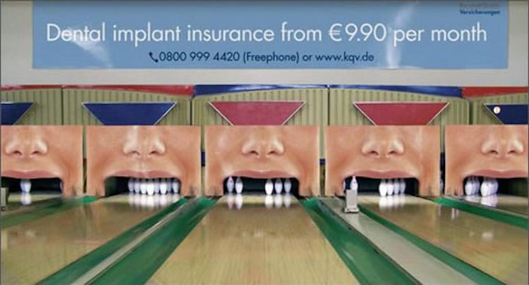
Dental insurance at bowling alley
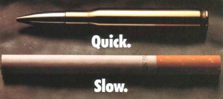
Quick. Slow. Stop Smoking
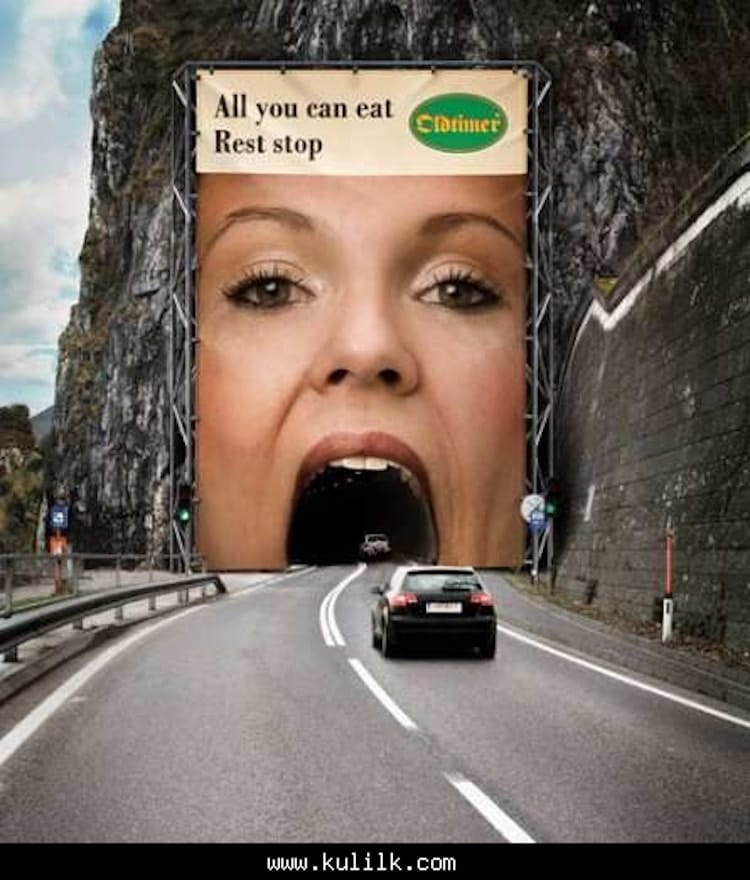
Super graphic rest stop ad
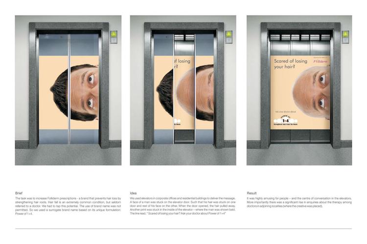
Elevator doors ad - baldness
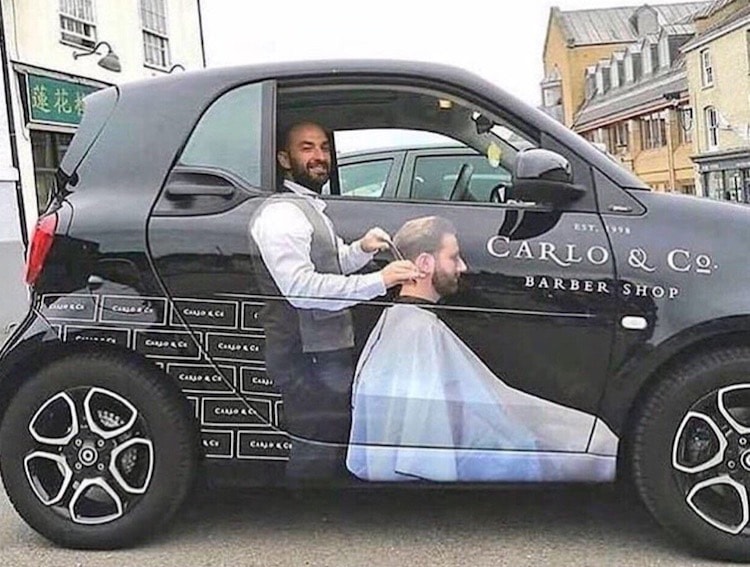
Big graphic on a small car

Fail - Unfortunate ad placement
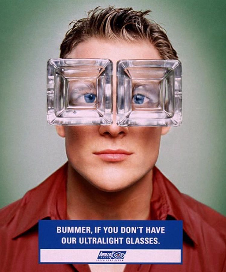
Ultra thin and light glasses
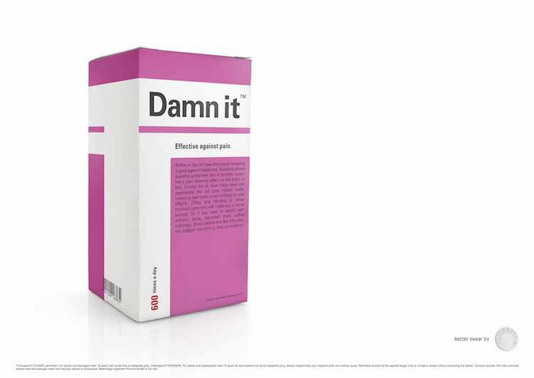
Humor claim - "effective against pain"
Might be legit, but we're not sure how this idea works...

Drive Through. Really?
And, as a touch of enduring, big-size advertising history...
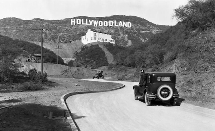
1923 Hollywoodland sign
The original Hollywood(land) Sign
The iconic Hollywood sign was created as a real-estate advertisement in 1923, according to history.com. Los Angeles Times publisher Harry Chandler decided to invest in an upscale real-estate development called Hollywoodland, which capitalized on the growing recognition of Hollywood as a movie-industry mecca. But, if you're not that old, look for it above Hollywood in the award-winning movie La La Land.
Please share your super-size ideas, graphics and examples...
Let us know what you think, and send over your own creative examples that break through the clutter and grab audience attention in a big way. We'll publish another collection of good examples in the future.
Related: Cosmetic Surgery Marketing & Cosmetic Surgery Web Design


