8 Burrs Under our Marketing Saddle: Wasteful Classic Clunkers
 The broad category of healthcare and hospital advertising is generally improving all the time. Savvy marketing and communications professionals are tuned-in to effectively reaching the increasingly aware and empowered healthcare consumer with high quality, creative messages.
But…amid volumes of “good stuff” we find some classic clunkers. It’s painful to see precious resources wasted on full-color (expensive) brochures, postcards, billboards and the like. These little burrs under our saddle rub us as ineffective and wasteful. So just to vent a little, here’s our list of irritating, but easy-to-avoid, errors. (For the benefit of students of marketing and advertising, please let us know what you would add to this list.)
Ego Advertising: Provider-centric healthcare has been the historic orientation for so long that it’s difficult not to automatically think of the doctor as the total personification of the practice and all things related. Simply showing his or her picture is message enough, right? Well, no. First and foremost, the patient-public wants to know what you can do for them, and your name alone doesn’t tell that story. This is a close cousin to…
What the boss wanted: Let’s assume that the head-honcho knows what’s best. But some advertising efforts obviously fall short in the execution. Somewhere in the chain of good intentions, the intended message, objective or call-to-action never made it to the final product. If the creative content is wrong or off course, it probably isn’t what the boss really wanted.
Clip Art Creativity: Personally, we’re an easy touch for cute puppy pictures. Who isn’t? Such images are attention getting, but the creative process does not begin with finding a compelling picture on file (just because it’s quick and convenient), and then adding a message obviously contrived to fit. No offense puppy, or other pretty picture, but that dog don’t hunt.
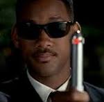
Bells, Whistles and Hardware: Modern medicine’s tools and technology are often amazing, and it’s great that you have the latest model Neuralizer (or whatever) on hand. Simply having the hardware isn’t impressive without telling the consumer public why or how it will benefit them.
Fast and Furious: A gotta-have-it-yesterday deadline and quick turn-around are magnets for errors and omissions. Doing it fast is no trade-off for doing it right.
Billboard from Postcard Art (and vice versa): A direct mail postcard and an out-of-home billboard often have similar rectangular shapes. But the creative execution of one is not interchangeable with the other. Two elements in a campaign can have a family similarity, but using identical artwork for both pieces will assure that at least one will be worthless.
He said, she said ads: Advertising that is based on directly answering a competitor’s advertising is usually misguided and ineffective. Sometimes there’s a visceral temptation to “set the record straight,” but the public is largely unconcerned.
All things to all people: “Go ahead, pick something from this complete list of everything we do.” Reserve this for when writing a menu for a Chinese restaurant.
For more burrs under our marketing saddle, see our previous posts about:
- Before and After Photos That Ruin your Message,
- How to Eliminate “Grip-and-Grin” PR Photos, and
- Is Your Professional Photo as Good as Your Professional Reputation?
What's under your saddle? Please add it to our list below.


